Design & appearance
Themes, colours, fonts, buttons, artwork and what your link looks like when it's shared.
Set it once, not per release#
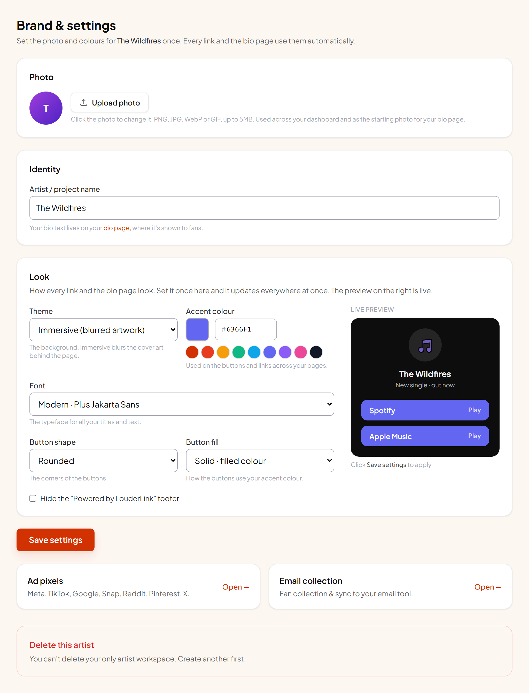
The look belongs to the artist, so changing it updates every page at once: existing links, new ones, and your bio page. You will find it under Settings rather than in an individual link.
Themes#
| Theme | Looks like |
|---|---|
| Immersive | Takes the colours out of your artwork and builds the background from them. Different for every release, and the default for good reason. |
| Dark | Flat dark background. Neutral and consistent across releases. |
| Light | Flat light background. Best when your artwork is dark or very busy. |
| Midnight | Deep indigo fading to black. |
| Sunset | Warm rose to orange. |
Accent colour, fonts and buttons#
The accent drives buttons, links and the glow behind the artwork. Pick something from your cover art rather than a colour from nowhere. Fonts and button shape are set the same way, and square or pill buttons change the feel of a page more than people expect.
Artwork#
Artwork comes from the release automatically. Override it per link when you want something different, for example a video still for a video premiere, or a cleaner crop for a page that will mostly be seen on phones.
What it looks like when shared#
When someone posts your link in a message or on social, the preview uses your artwork, title and description. You can set a separate social share image per link, which is worth doing when your cover is square but the preview slot is wide.
ℹ Previews are cached by the platforms
Removing our branding#
Free, Indie and lower plans show a small "Powered by LouderLink" line at the bottom of public pages. Pro and above can switch it off, which matters most when you are handing pages to a client under your own name.