
Reading your analytics
What every panel on a link's stats page measures, and what to change when it tells you something.
Where to find it#
Open Links, then click the link you want. That page is the full picture for that one link. A bio page has the same page under Link in bio, and the dashboard home shows the totals across everything.
Timeframe and comparisons#
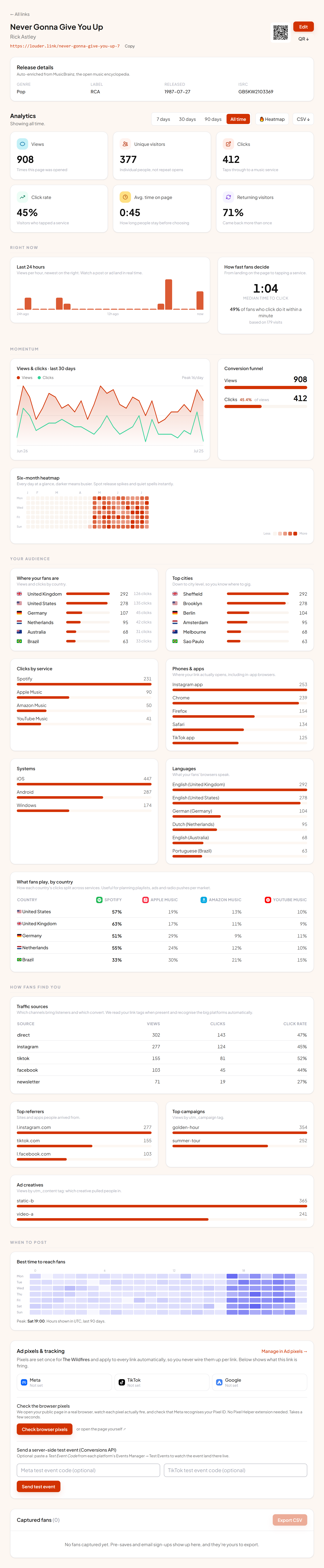
The tabs at the top set the window for the whole page: 7 days, 30 days, 90 days or All time. Everything below reacts, including the breakdowns.
When you pick a bounded window, each stat card also shows the change against the window immediately before it. Green means up on the previous period, red means down. All time has nothing to compare against, so no arrows appear.
ℹ How far back you can look
The numbers at the top#
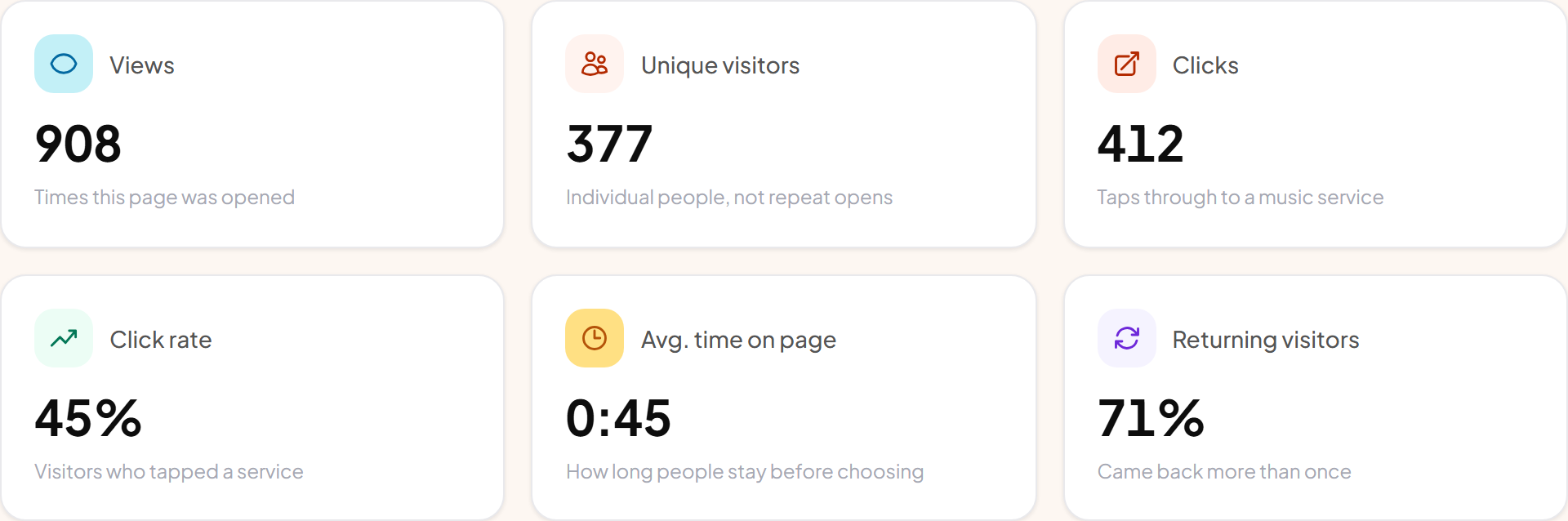
| Number | What it counts |
|---|---|
| Views | Times the page was opened, including repeat visits by the same person. |
| Unique visitors | Individual people rather than opens. A fan who checks twice counts once. |
| Clicks | Taps through to a music service. This is the number that means someone actually went to listen. |
| Click rate | Clicks divided by views. Under about 40% usually means the page is asking too much before the buttons. |
| Avg. time on page | How long people stay before leaving. Very short times with a low click rate suggest the wrong audience is arriving. |
| Returning visitors | Share of unique visitors who came back at least once. |
Pre-save links add Pre-saves and Emails captured. If the inline player is switched on, Preview plays appears once someone presses play.
Right now#
Last 24 hours is a bar per hour, newest on the right. It is the fastest way to see a post or an ad landing, and to spot the moment it stops working.
How fast fans decide takes every visit where someone both landed and clicked, and reports the median gap. A median of a few seconds means the page is doing its job. A long median, or a low share deciding within a minute, means people are hesitating: usually too many buttons, or a service they don't use sitting at the top.
Momentum#
The trend chart plots views and clicks per day across your chosen window. The conversion funnel beside it shows how many of the people who arrived went on to click, and to pre-save where that applies.
The six-month heatmap is one square per day for the last 26 weeks, darker on busier days. It ignores the timeframe tabs on purpose, so release spikes and quiet spells stay visible whatever window you're looking at.
Your audience#
Where your fans are lists countries with both views and clicks, so you can see which markets actually convert rather than just which ones look busy. Top cities narrows that down, which is the panel to open before booking shows.
Phones & apps is worth a look if the numbers ever seem strange. It names the browser, including in-app ones, so you can tell when most of your traffic is opening inside the Instagram or TikTok app rather than a normal browser.
What fans play, by country splits each market's clicks across services. It is the panel that tells you Spotify dominates in one country while Apple Music leads in another, which changes where a playlist push is worth the effort.
ℹ City data needs one setting
How fans find you#
Traffic sources is a table of views, clicks and click rate per source. We read the tag on your link when there is one, and recognise the big platforms automatically when there isn't, so a share from Instagram shows as Instagram rather than as direct traffic.
Top referrers lists the sites and apps people arrived from. Top campaigns and Ad creatives group by the campaign and creative tags on your links. See Campaign tracking for how to tag them.
When to post#
The last panel is a grid of weekday against hour, built from the last 90 days, with the busiest cells darkest. Use it to time an announcement for when your fans are already looking, rather than when you happen to be awake.
⚠ Hours are UTC
Getting the data out#
CSV at the top of the page downloads a row per day for the selected window with views and clicks, ready for a spreadsheet. For something you can hand to a label or a manager, use reports instead.